
Brand Basics
This is your go-to resource for the York Heritage visual identity. The tools and templates on this page are to help you use the brand easily and consistently.


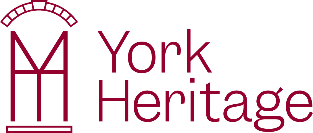
York Heritage Logo

Primary Logo
This is York Heritage’s go-to logo for most cases. Constructed and architecturally correct; giving ode to the original logo.

Logomark
When space is an issue, the York Heritage Logomark can be used.

Wordmark
This is reserved for special cases where the logomark is placed somewhere on the same application.
Typography

Garnett Regular
Garnett Regular is the primary York Heritage typeface. It should be used for everything.

Garnett Light
In cases where you need distinction between a title and body copy, use Garnett Light as body copy. This can be used for any longer pieces of text like in a document or brochure.
Colours

Crimson + White
These are our brand colours: Crimson and White.

Accent Colours
These accent colours are made to highlight and modernize certain elements in our brand.

Colour Pairings & Combinations
If there is ever a case to use more than one colour, these colour combinations are chosen for max contrast and high visibility,
Illustrations & Pattern

Illustrations
Our illustrations are based off the unique door and window features of our buildings.

Pattern
This brand pattern was created for decorative uses on documents and signage.
Templates
Documents
Mailing Labels
